Co-op was struggling for cut through in a heavily saturated market and needed to modernise how they came across as a brand.
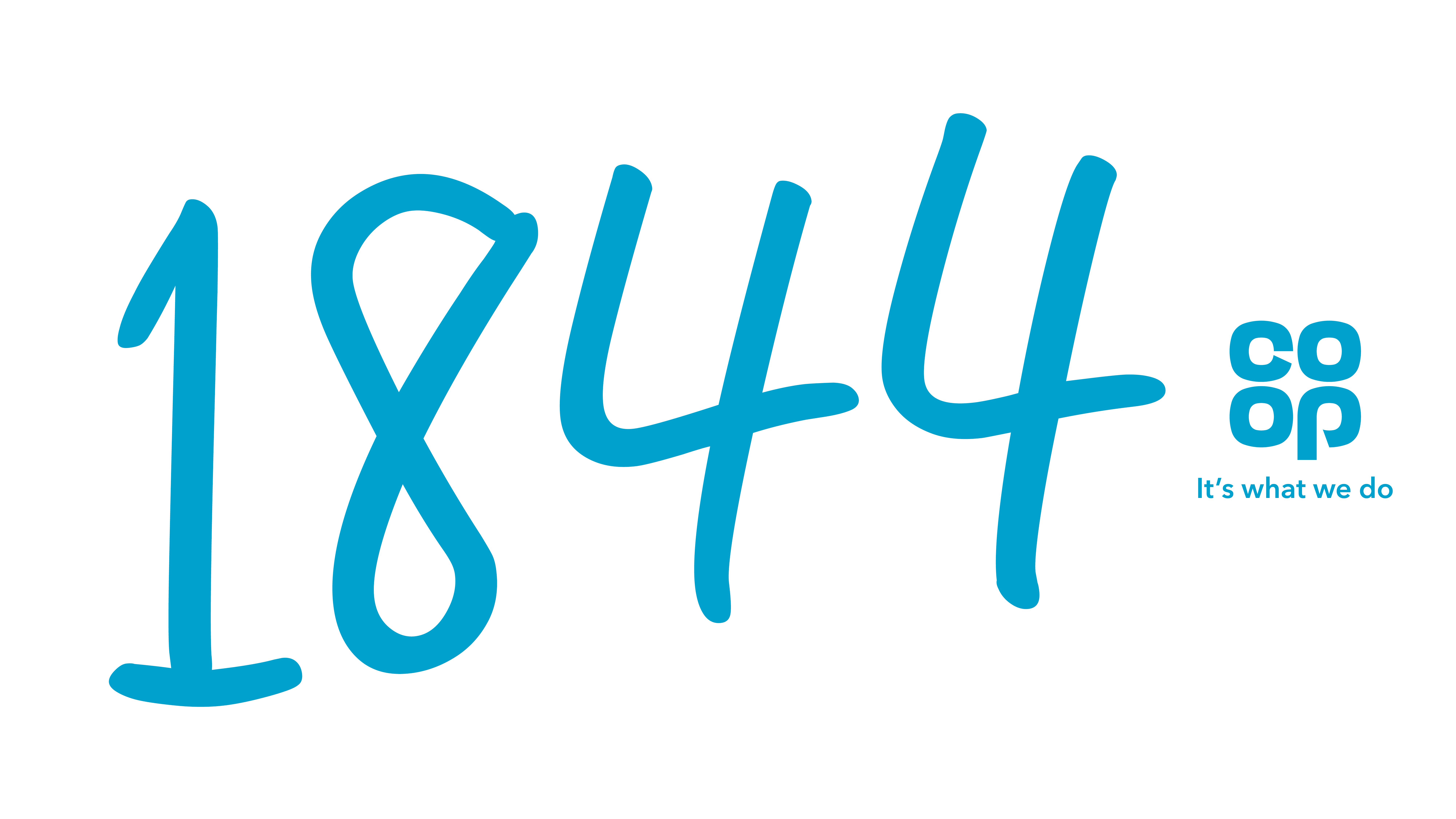
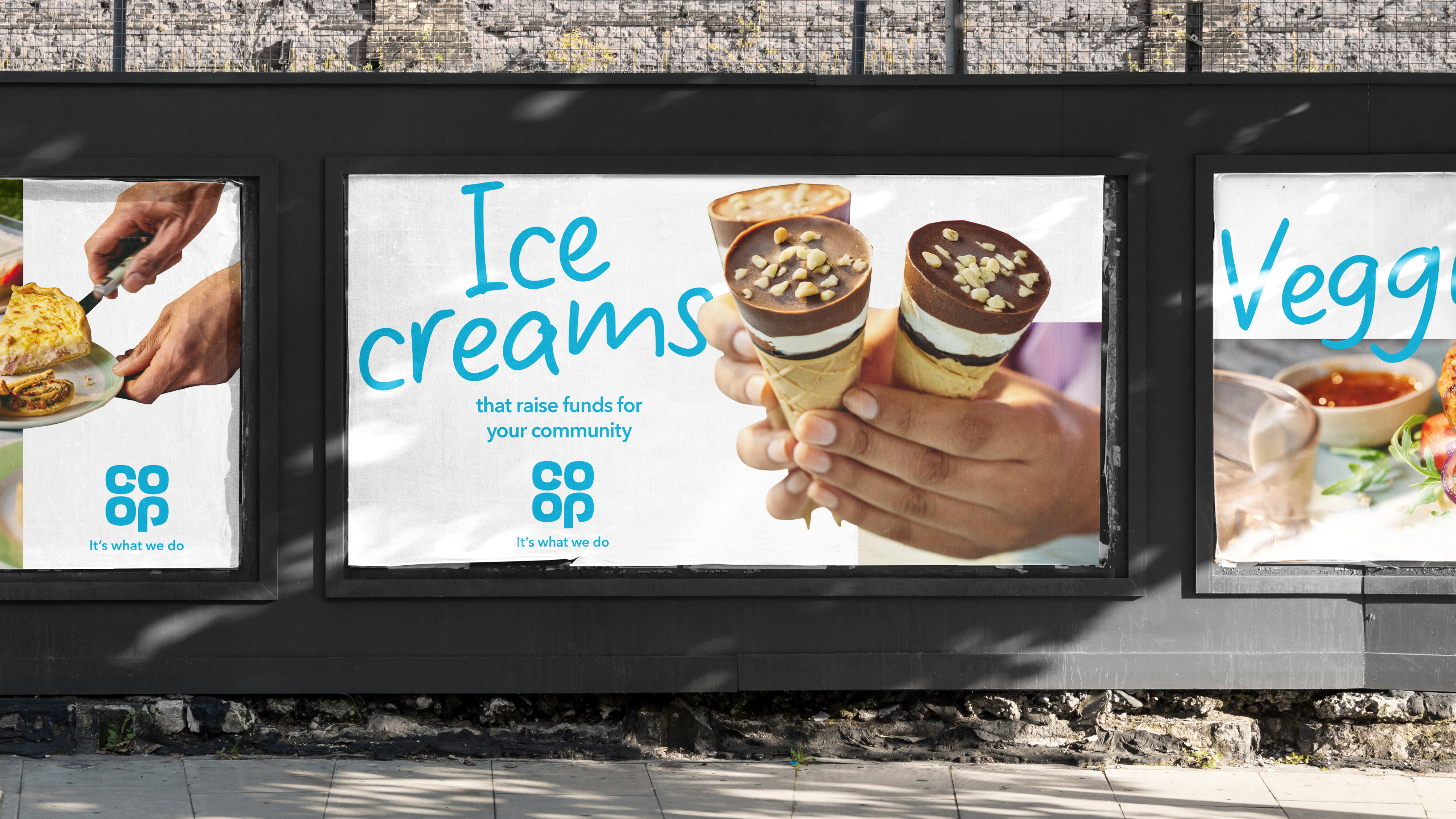
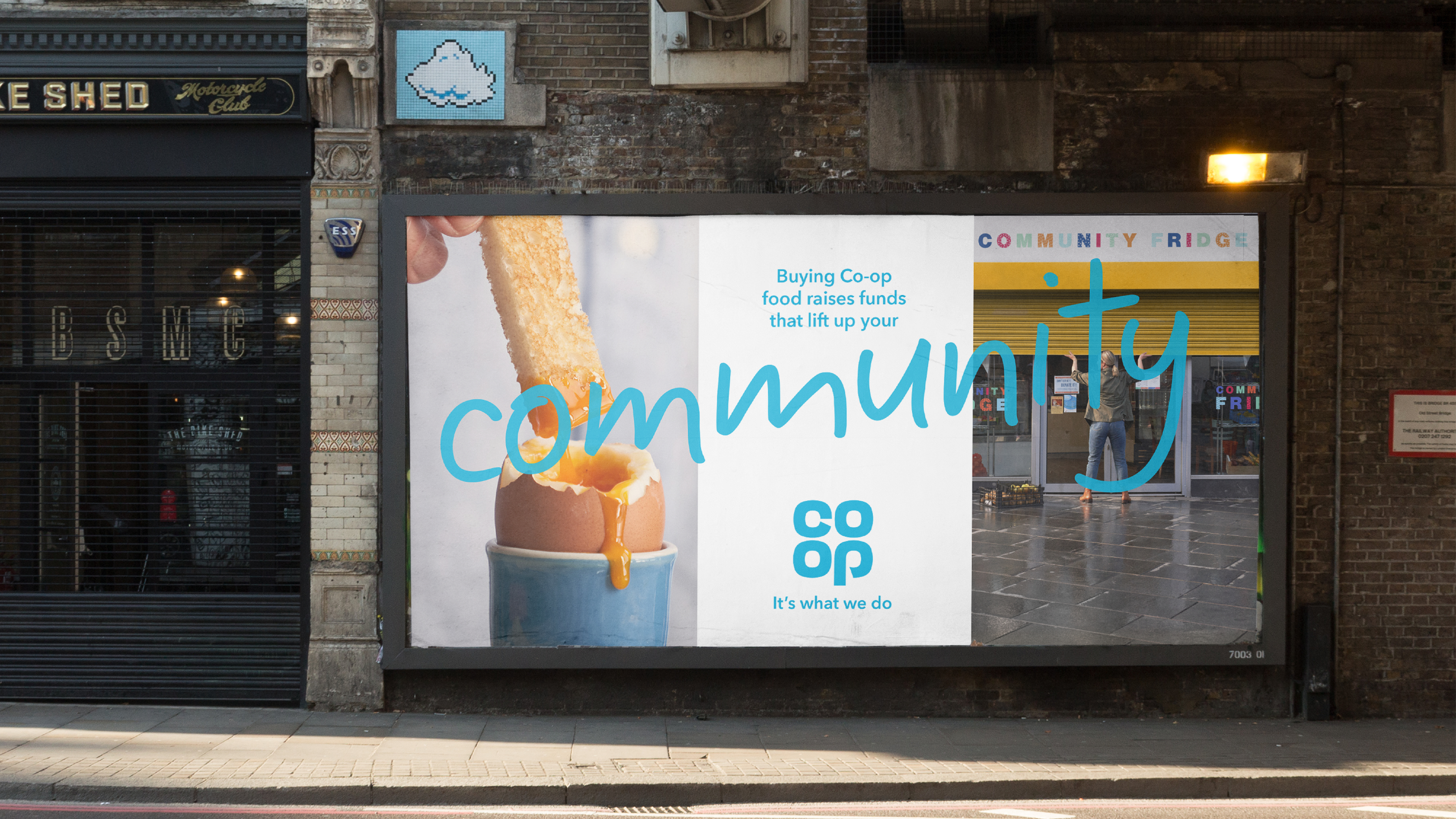
Their point of difference being their business founded by their members up in Manchester all the way back in 1844, Co-op has always been rooted in the community.
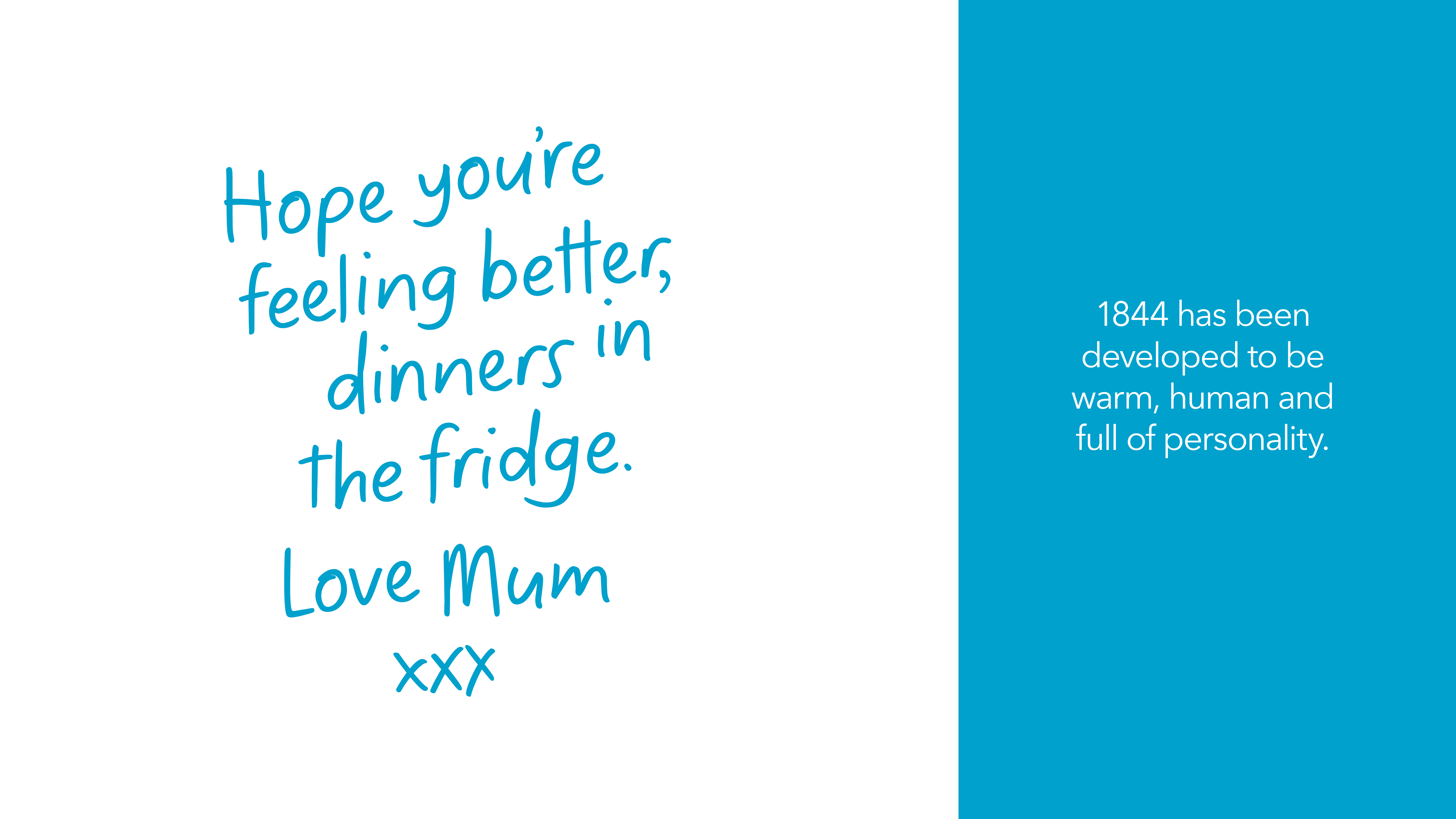
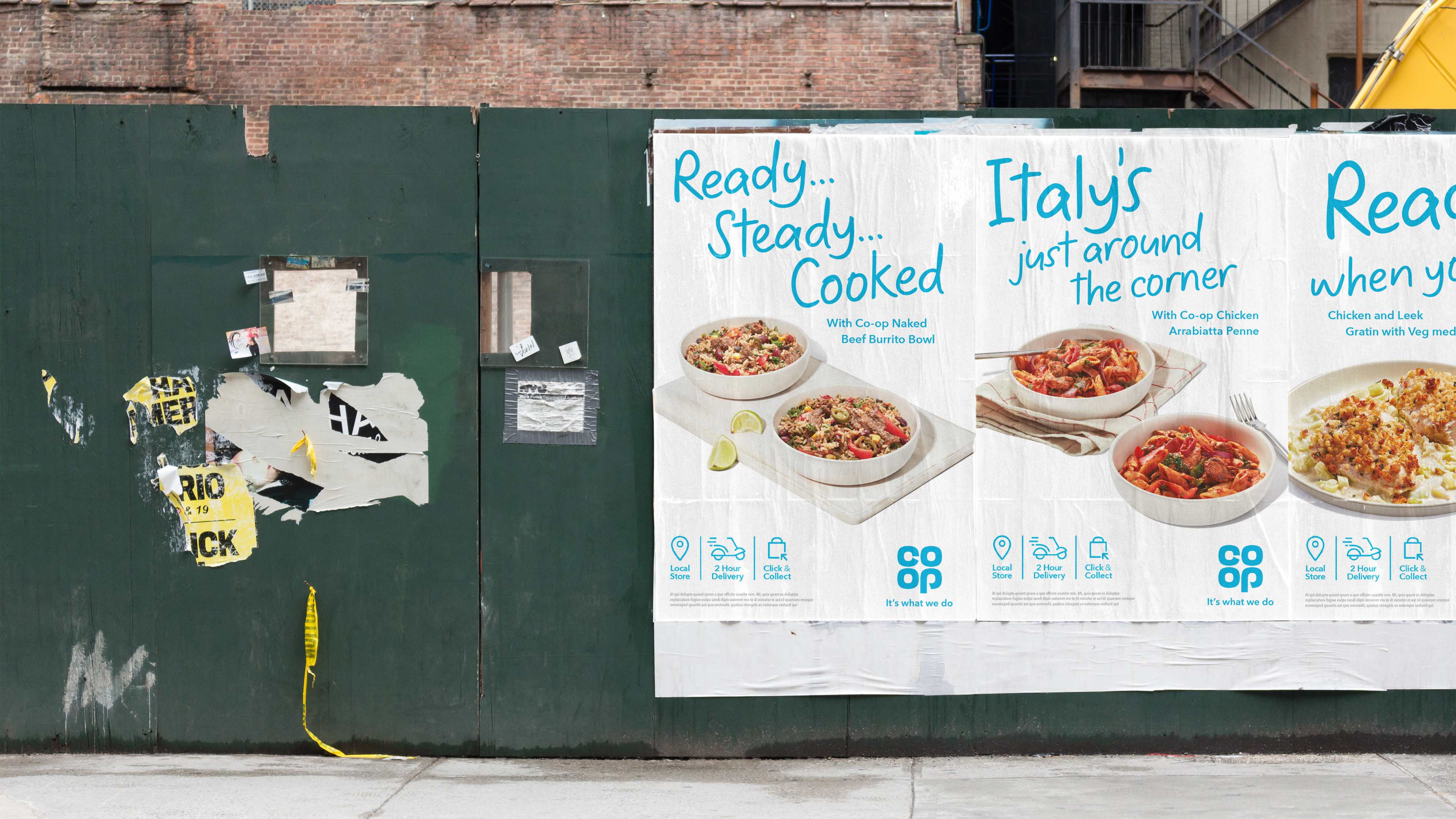
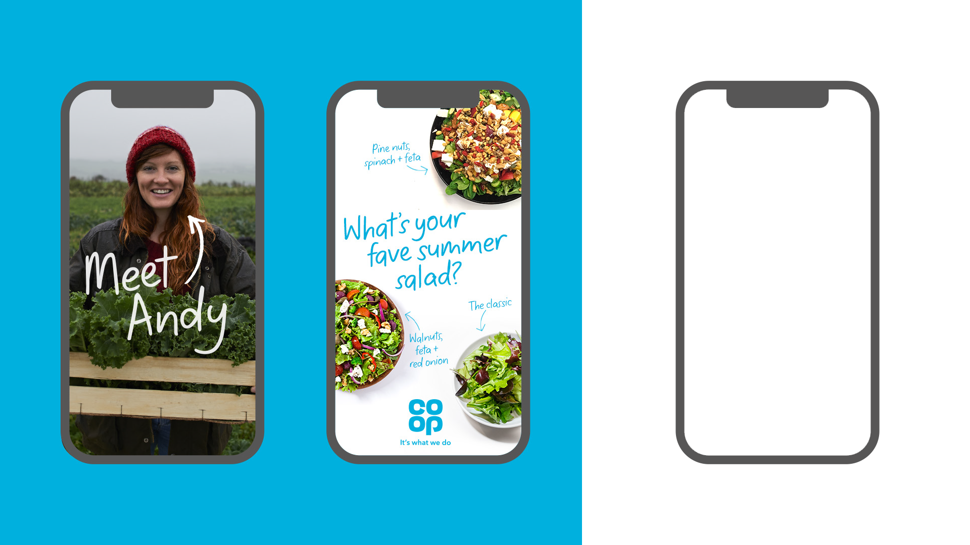
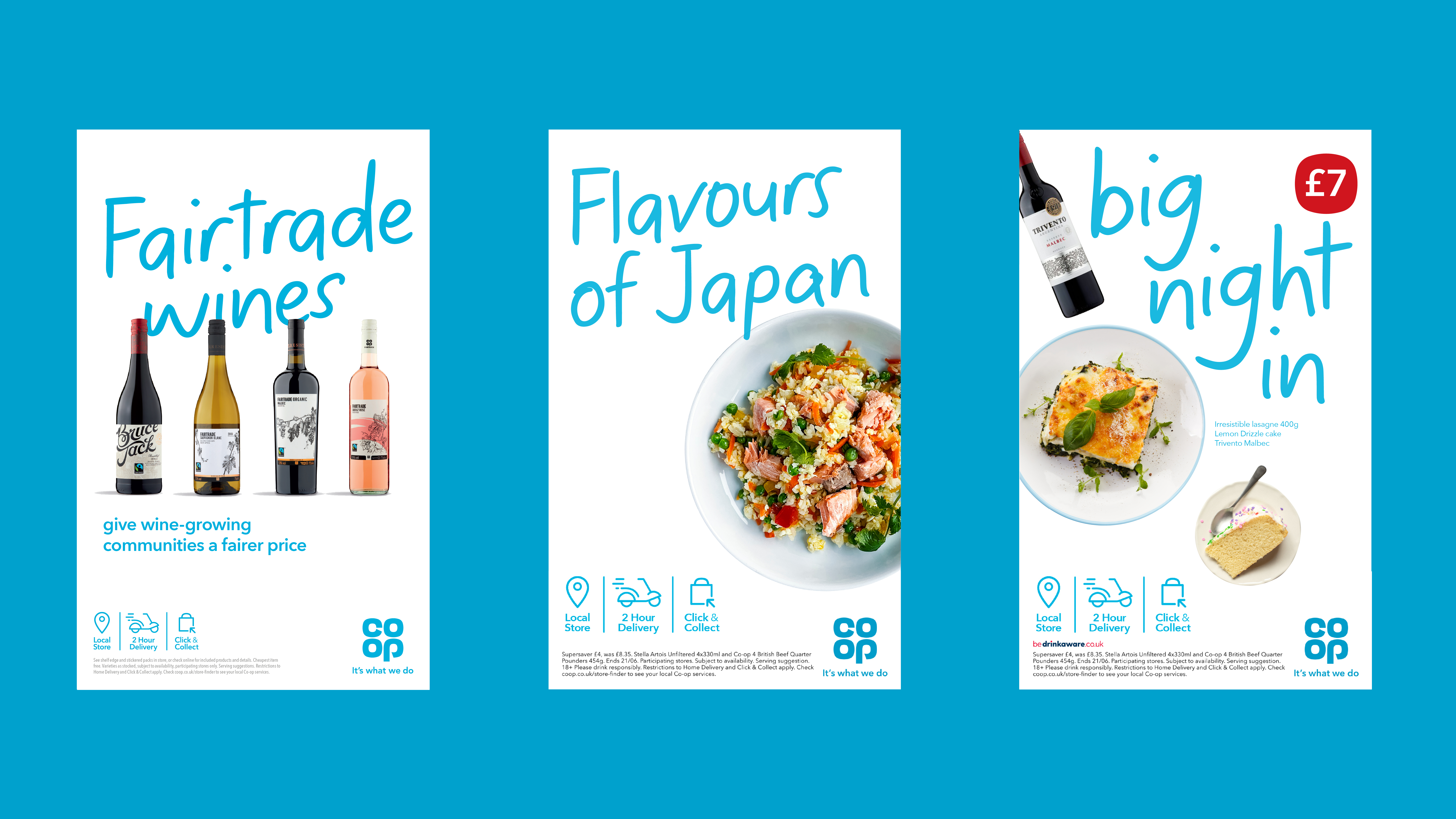
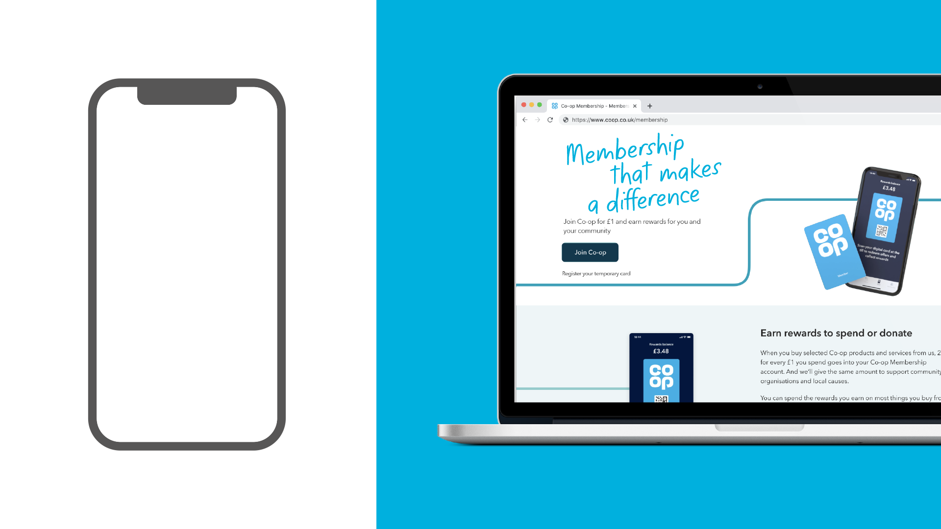
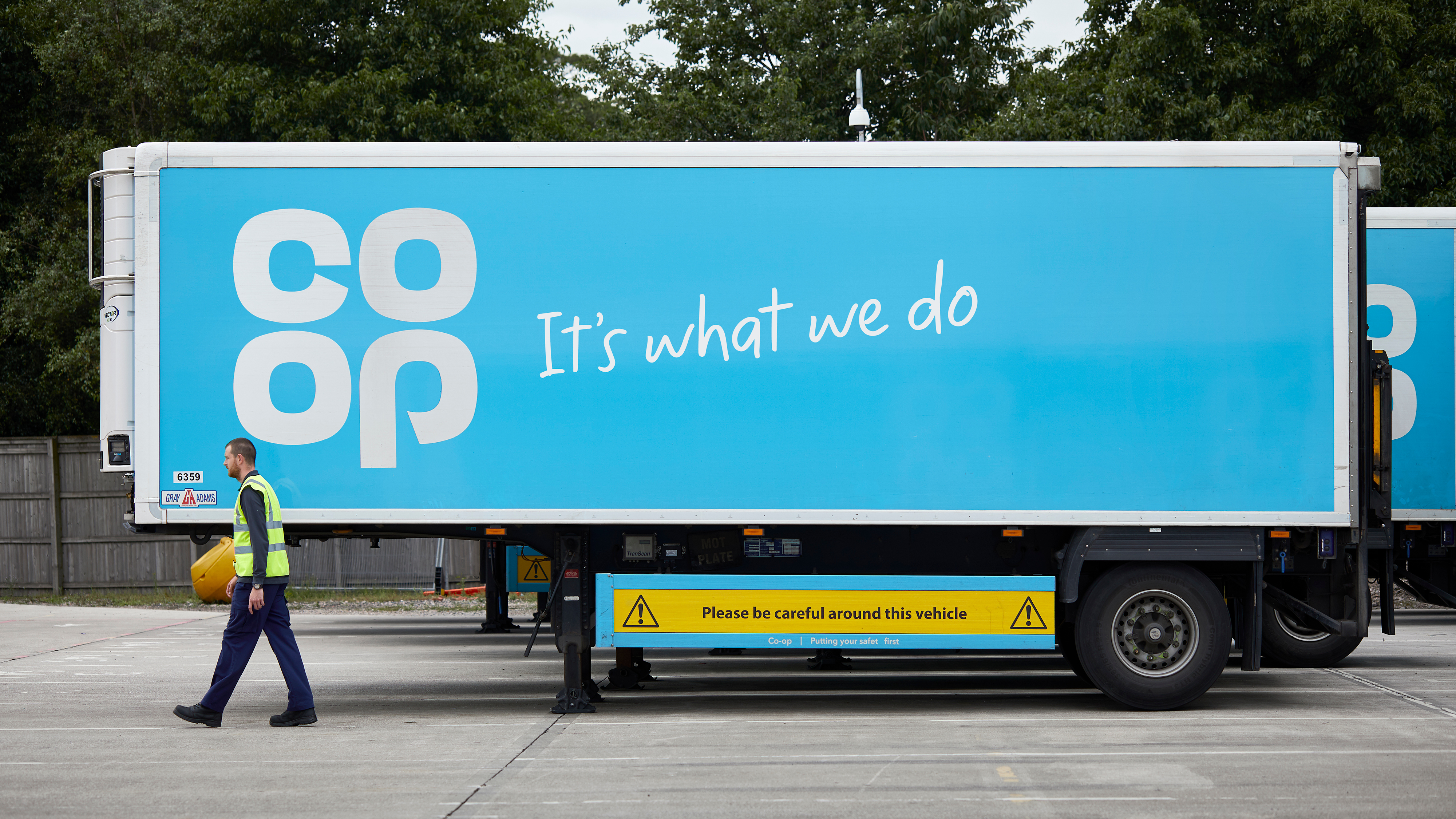
They had a strong brand accent in colour (Co-op Brand Blue ) however their primary typeface (Avenir Next) lacked the warm and spirit that their brand needed.
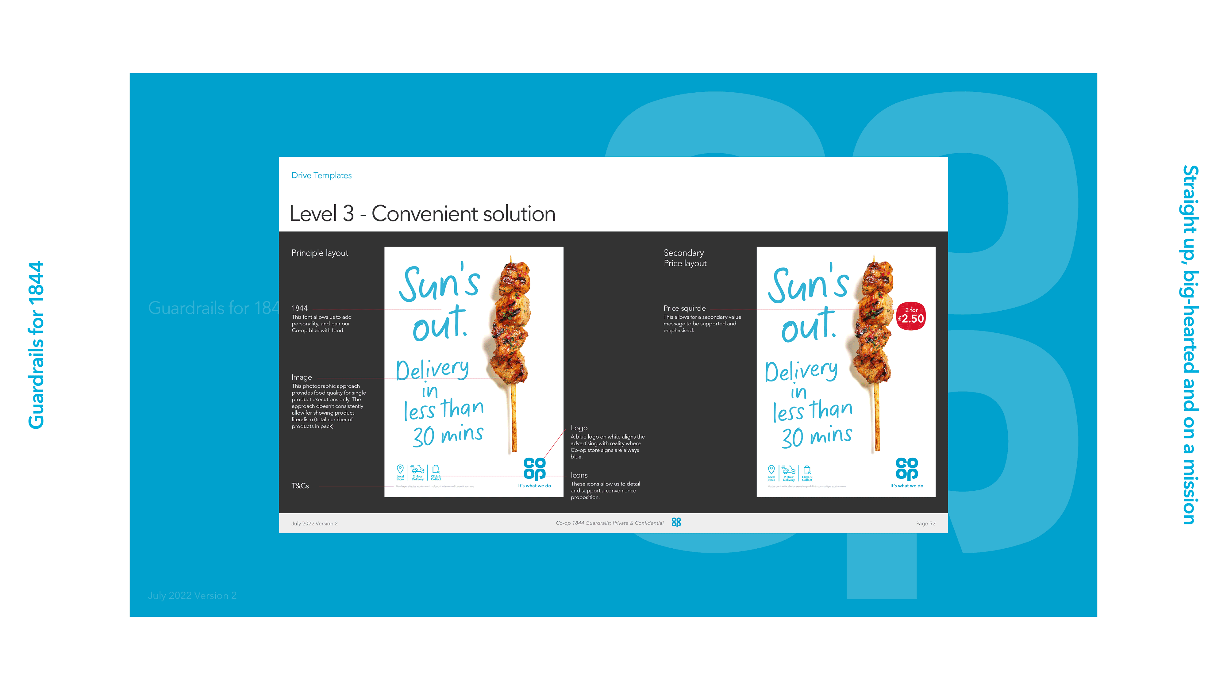
1844 was created to improved consistency, attribution, personality and fluency throughout comms in all channels and platforms of the business.
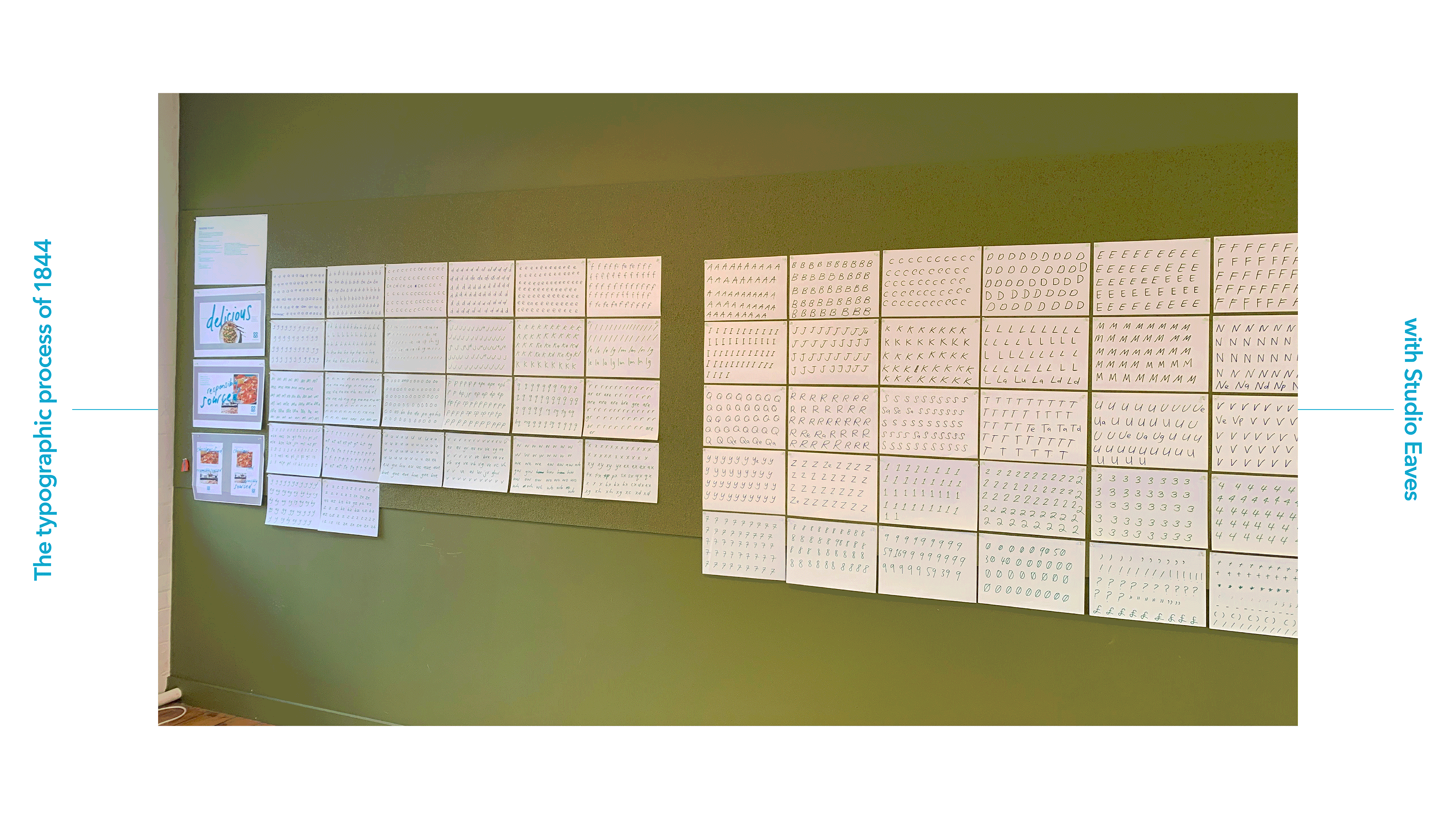
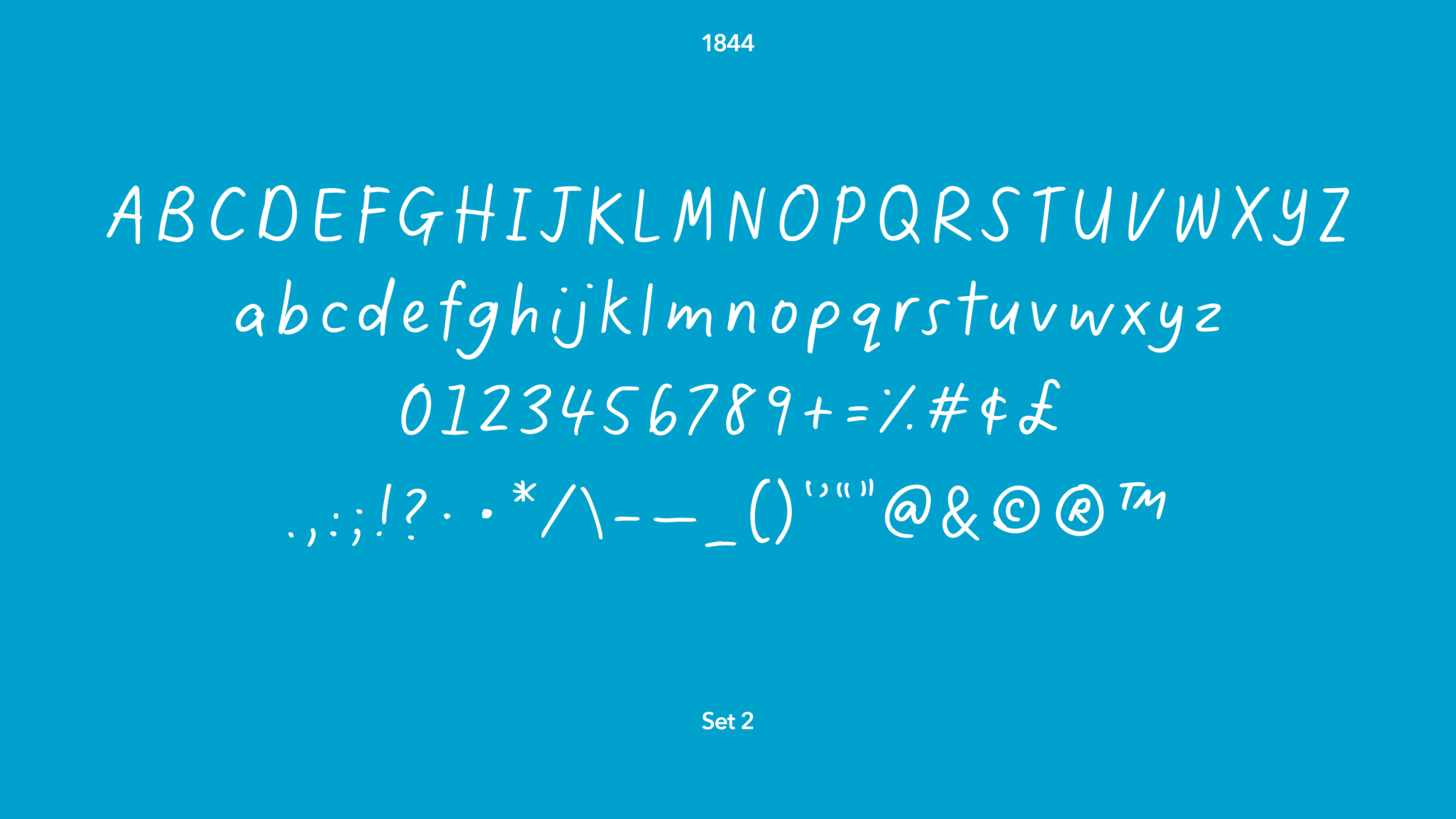
My hand writing was used as the foundation for 1844, working closely with Emma from Studio Eaves to bring it to life and the team at Co-op to ensure a successful roll out through their business.
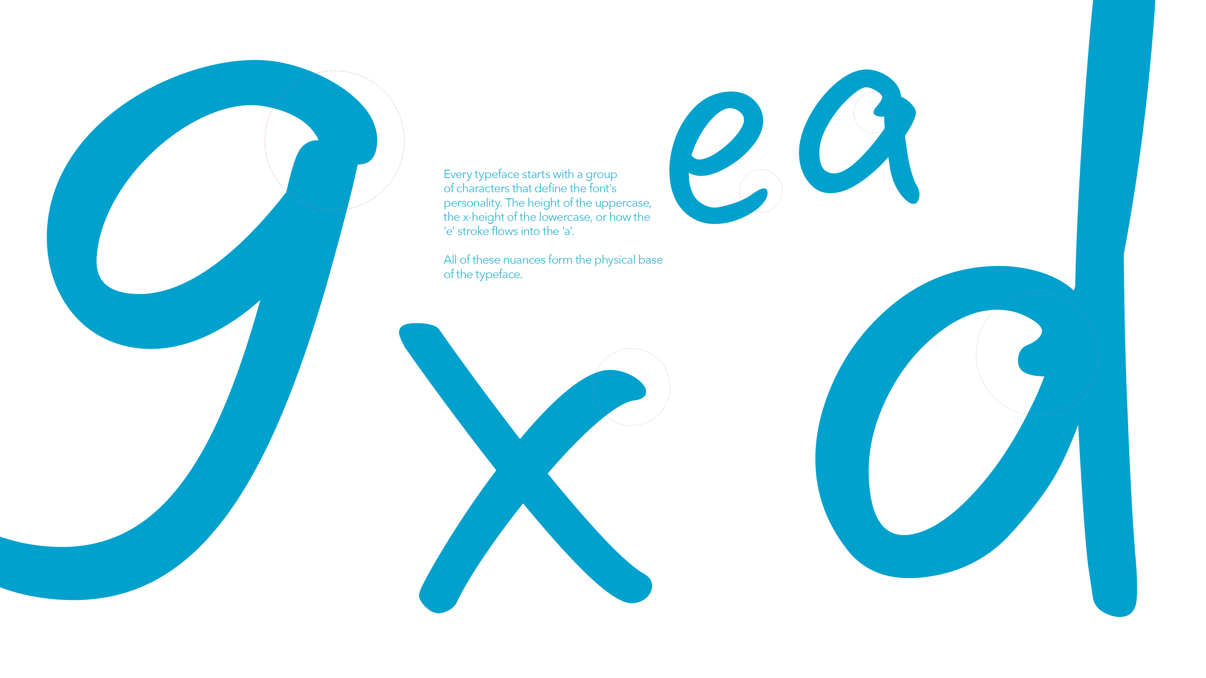
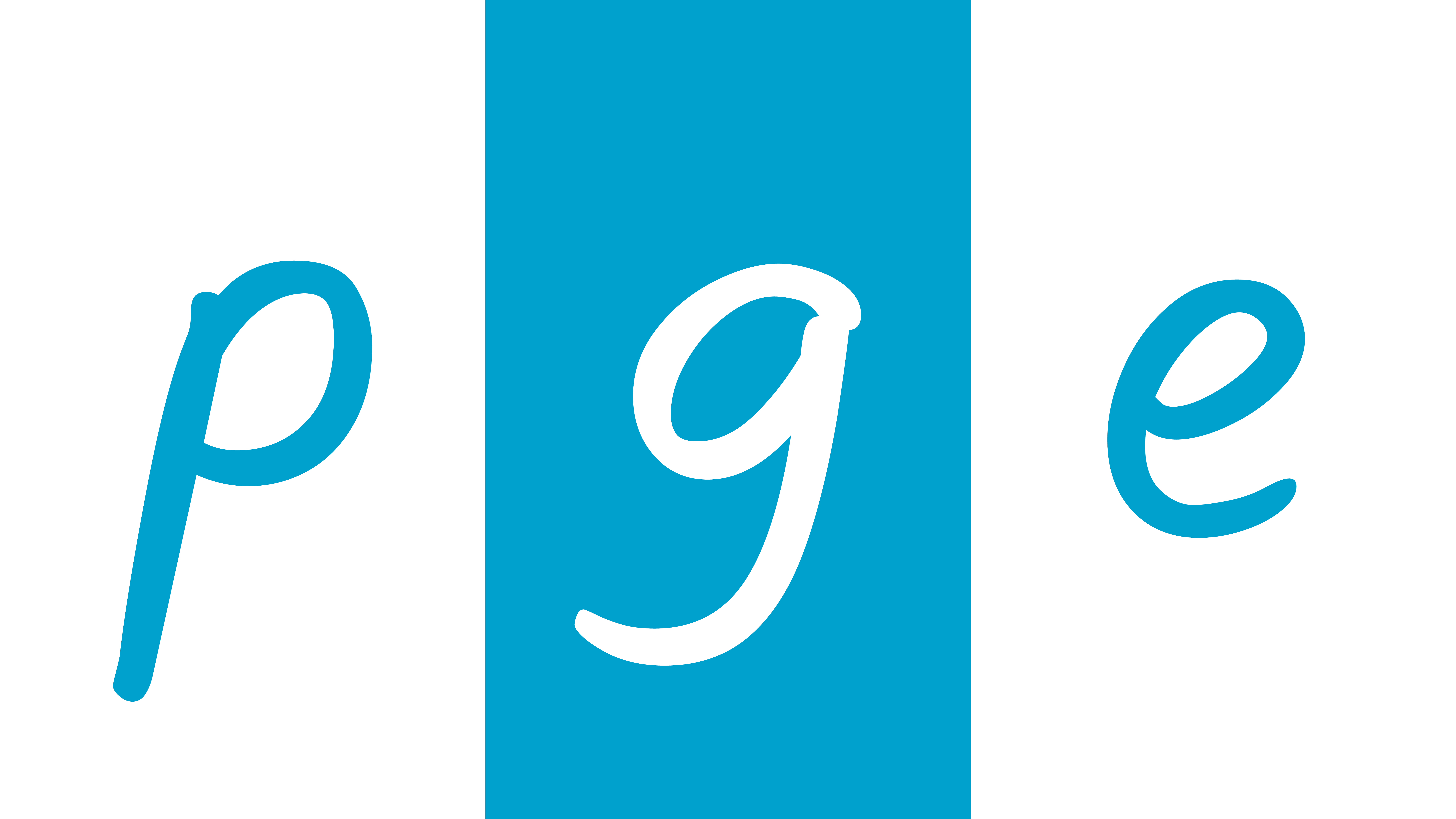
The family is comprised of 3 sets of uppercase, lowercase, numerals, punctuation and marks. The backend of 1844 has been coded to use all 3 sets when typing.
Agency: Lucky Generals
Creative Director: Danny Hunt
Head of Design: Jim Bletas
Design Director: Shakira Twigden
Typographer: Emma Williams (Studio Aves)
branding/campaign/guidelines/photography/art direction/typography